Lyft.com
Design, Illustration
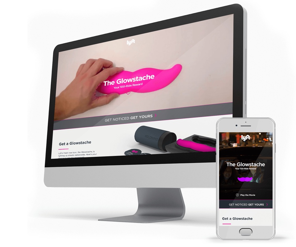
Oh, the days when Lyft was a 70 person company, and we planned to make our entire website in a one-day hackathon.
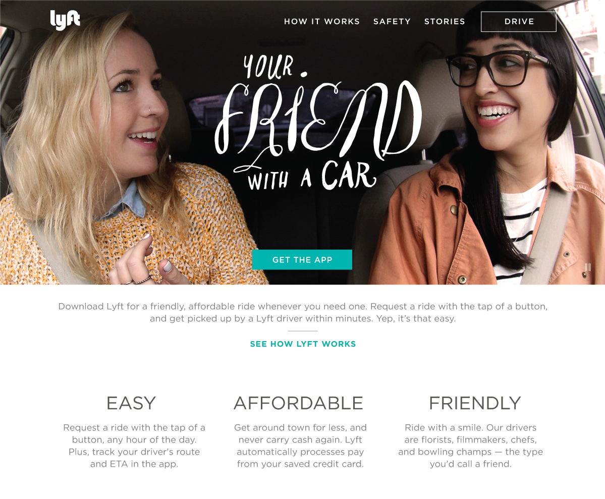
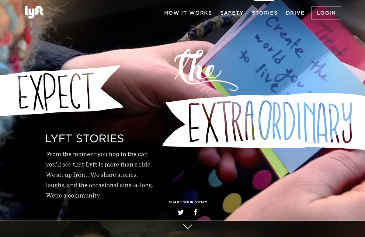
We must have done something right, cause we made that friendly vibe, and they came. I enjoyed the press we received, like this rando breakdown of our brand that referenced the stories page I designed and was so proud of; as well as the brand analysis comparisons that frequently popped up would always show this shot of the hipsters with my hand-drawn type juxtaposed with Uber's slick douchiness.
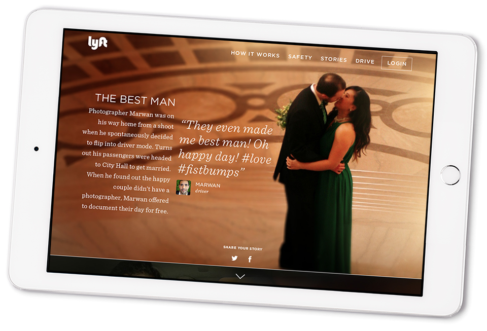
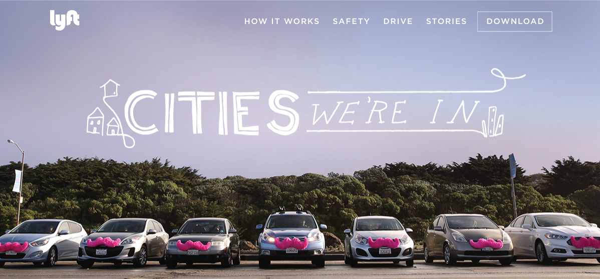
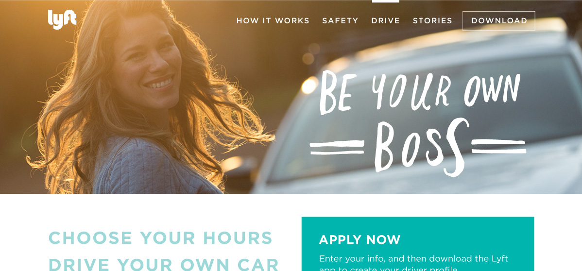
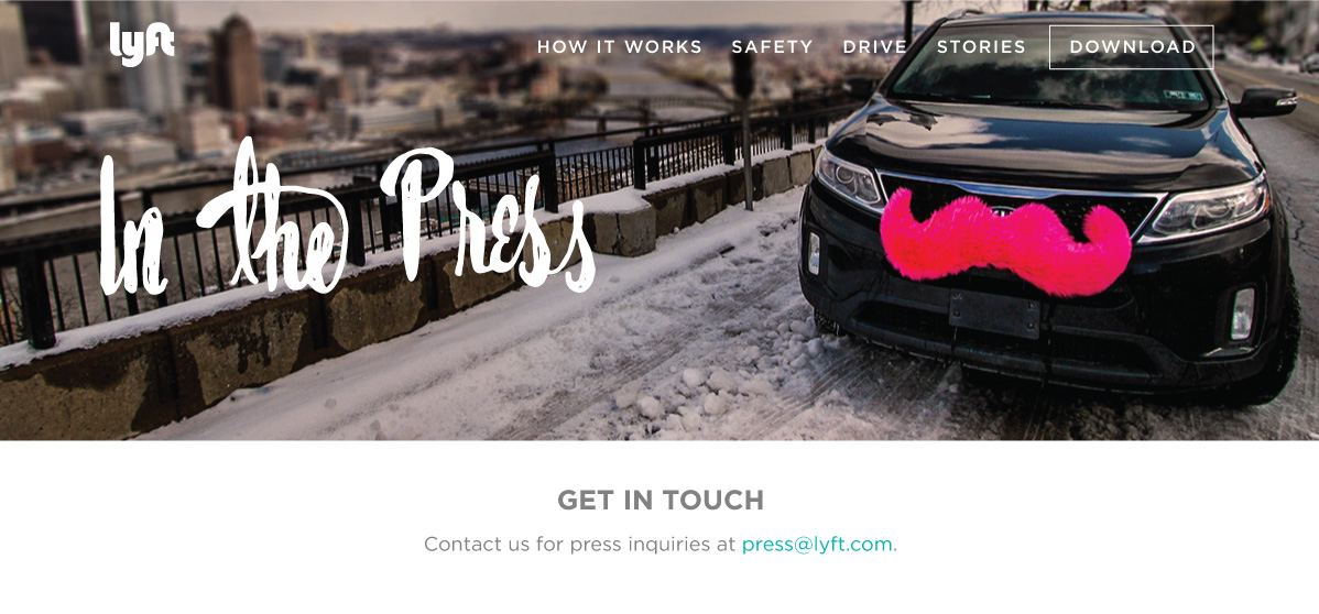
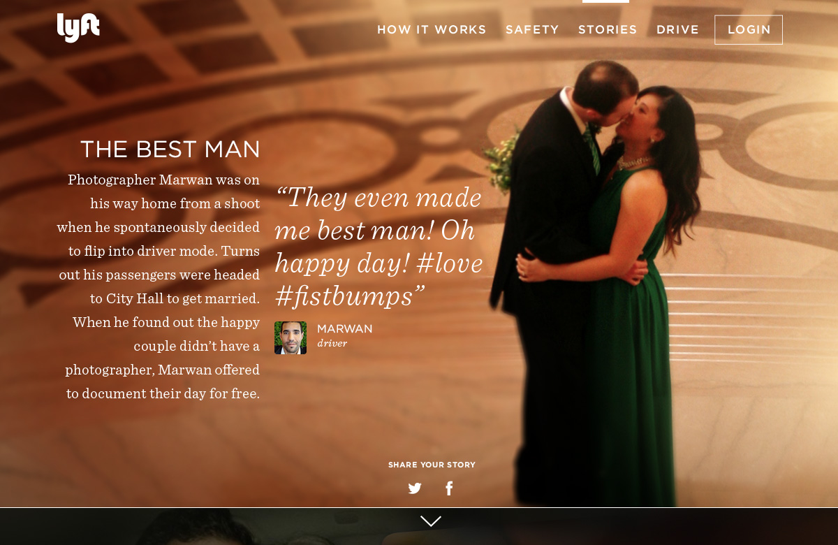
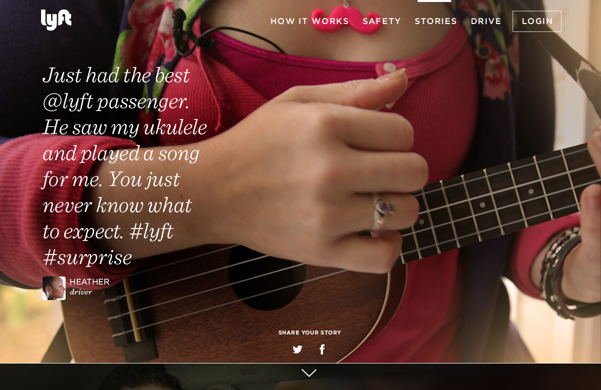
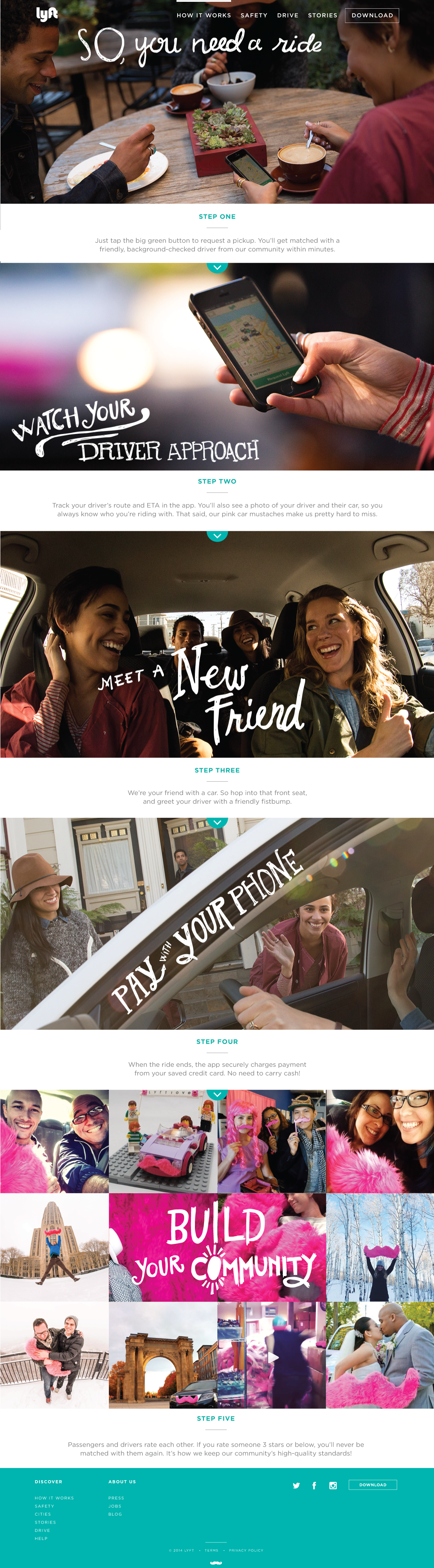
The talented miss Rosie Bubb did most of the text heavy pages, but I was lucky enough to get to do my favorite hand drawn type on all the headers, and design the two sections that were more like microsite interactive experiences - the step through on How it Works and the Stories page shown below. RIP stories section.
You can see an archived version of the original (minus the hoefler typefaces) here!
Oh, the days when Lyft was a 70 person company, and we planned to make our entire website in a one-day hackathon.
We must have done something right, cause we made that friendly vibe, and they came. I enjoyed the press we received, like this rando breakdown of our brand that referenced the stories page I designed and was so proud of; as well as the brand analysis comparisons that frequently popped up would always show this shot of the hipsters with my hand-drawn type juxtaposed with Uber's slick douchiness.
The talented miss Rosie Bubb did most of the text heavy pages, but I was lucky enough to get to do my favorite hand drawn type on all the headers, and design the two sections that were more like microsite interactive experiences - the step through on How it Works and the Stories page shown below. RIP stories section.
You can see an archived version of the original (minus the hoefler typefaces) here!